Screen Resolution Size and Website Responsiveness
Screen Resolution Size and Website Responsiveness
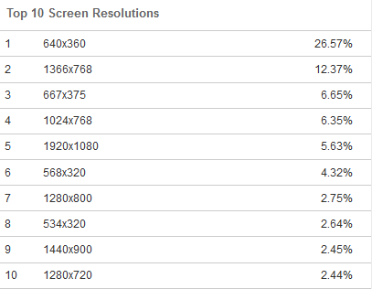
Below are data and source location for screen resolution size for websites. Purpose is for Developers to do screen size breakpoints for making website responsive to changes of size of their User’s devices.

Reposition top 10 screen resolutions by type – Desktop, Laptop, Tablet, and Mobile devices.
| Rank | Screen Size | Usage | Type |
| 5 | 1920×1080 | 5.63% | Desktop |
| 9 | 1440×900 | 2.45% | Desktop |
| 2 | 1366×768 | 12.37% | Laptop |
| 7 | 1280×800 | 2.75% | Laptop |
| 10 | 1280×720 | 2.44% | Laptop |
| 1 | 640×360 | 26.57% | Mobile |
| 3 | 667×375 | 6.65% | Mobile |
| 6 | 568×320 | 4.32% | Mobile |
| 8 | 534×320 | 2.64% | Mobile |
| 4 | 1024×768 | 6.35% | Tablet |
You can now adjust your breakpoints to the devices. Example:
- Laptop 1400 px
- Tablet 1050 px
- Mobile 800 px
So design your website in Desktop screen of 1920 px, and do breakpoints as above for different screen sizes.
For Developers using Themify: Go to wp content/themes/YourThemeName/themify/themify-utils.php > Find function themify_get_breakpoints and change max settings to your desired setting:
- ‘tablet_landscape’ => array(769,1400)
- ‘tablet’ => array(681,1050),
- ‘mobile’ => 800
Now go to your settings. If you’re using Themify: Dashboard > Your Theme > Themify Settings > Theme Settings > Set Responsive Design to max values (or your desired value).


